Case study
PowerWizard
Research and experimentation
Summary
Problem: Improve conversion and reduce design rework on a consumer energy marketplace.
- Role
- Principal Web UX Designer
Outcomes
- Measured
5% sitewide conversion lift — Homepage hero test, driven by mobile.
- Measured
1% desktop win — Product listing page test.
- Measured
Three days to under four hours — Redesign time.
Product walkthroughs
Four illustrations of the marketplace interface: the savings explorer, the plan card, plan details, and match results. They recreate the interface; they are not live recordings. Rates, bills, scores, and usage figures shown are sample data, not results. The measured results are listed under Outcomes. I built the illustrations in code with Claude Code.
Savings Explorer
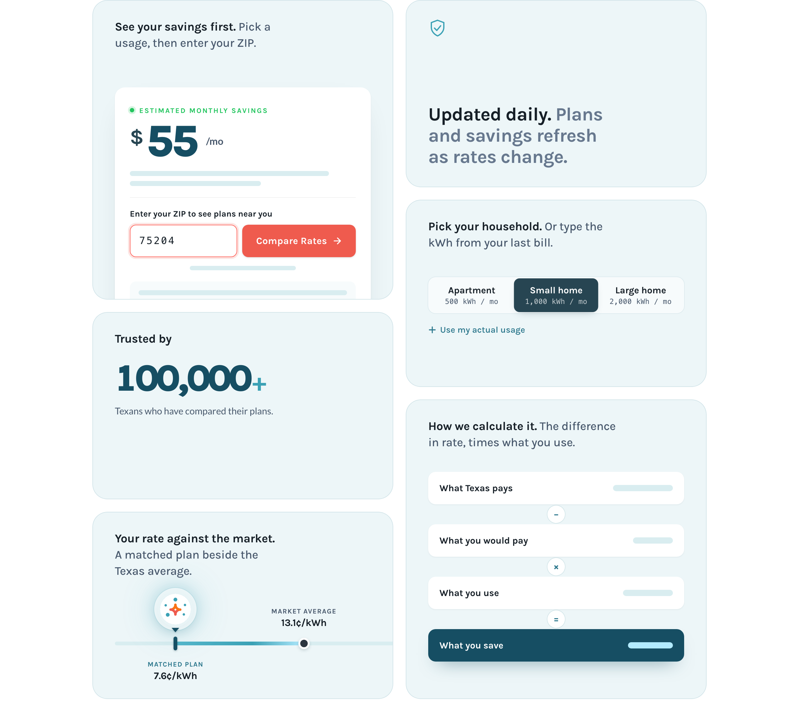

Paused. Press play to watch.
Plan Card Decision
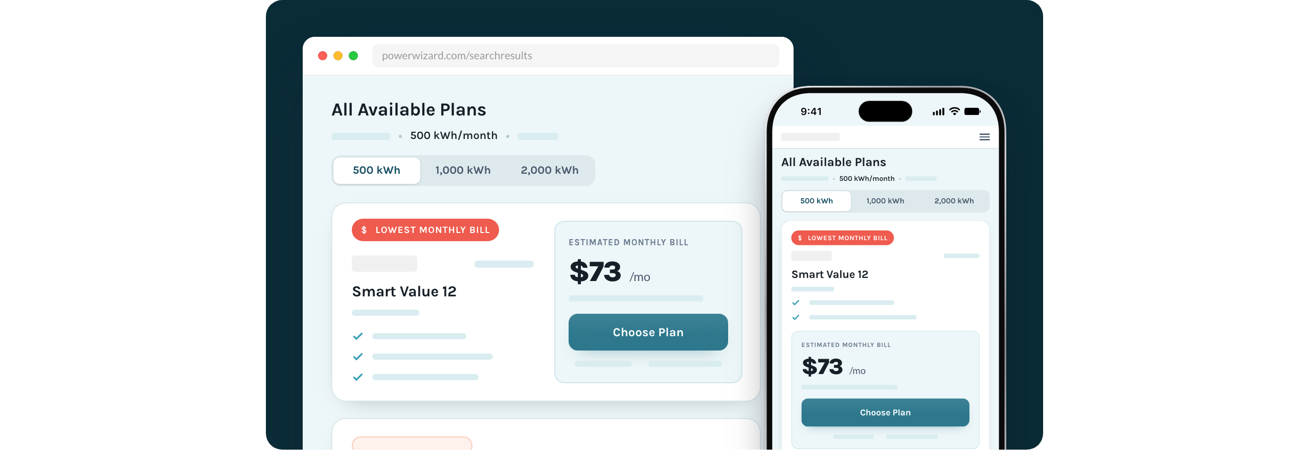
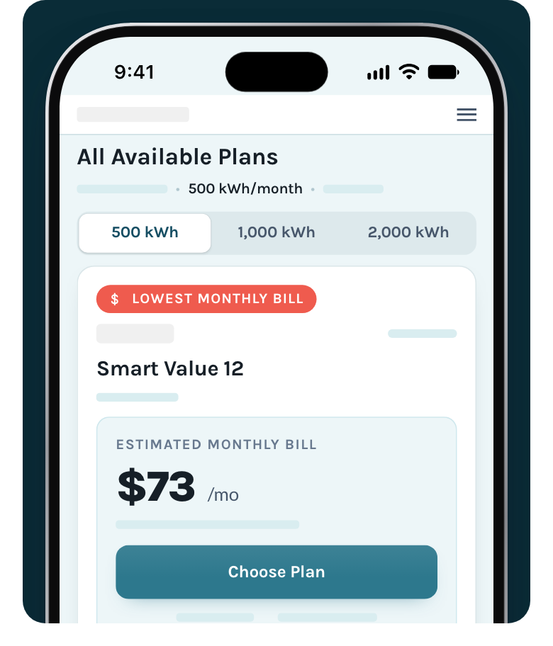
Paused. Press play to watch.
Plan Details Drawer
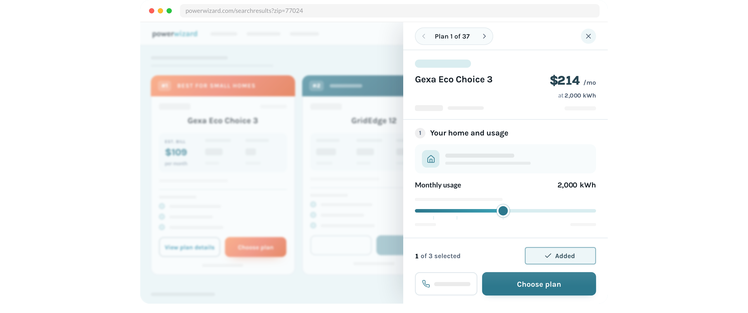
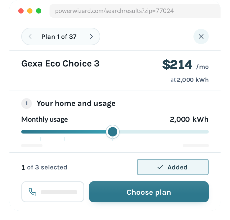
Paused. Press play to watch.
Plan Match Results

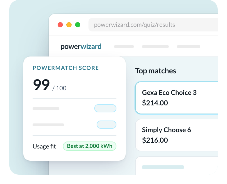
Context and stakes
PowerWizard is a consumer marketplace for comparing electricity plans. The work had two goals: convert more shoppers, and cut the time lost to design rework.
As Principal Web UX Designer, I designed PowerWizard's energy marketplace. I started with AI-generated prototypes, then built the research and testing program that informed what shipped. I prototyped the conversion funnel in working code that engineering used as the build specification, and built a reusable component library to keep pages consistent across platforms.
I managed agency partnerships by defining the scope, quality standards and review checkpoints so the work aligned with our design system and brand.
Evaluation
I ran two A/B experiments over three months on the homepage and product listing page. I also led a web-app prototype usability study with 20 Texas residents on mobile and desktop; fixes from that test were implemented before launch. For the rooftop-solar offering, I ran a 15-participant qualitative study with Californians to define user needs.
Outcome
Measured: 5% sitewide conversion lift from the homepage hero test, driven by mobile.
Measured: 1% desktop win on the product listing page.
Measured: redesign time fell from three days to under four hours.
What I would change now
I would turn plan comparison into a personalized energy plan guide. The current flow shows shoppers a list of plans and leaves the sorting to them. I would start with the shopper instead.
A short questionnaire first.
Before showing any plans, I would ask about:
- Household energy habits
- Where the home is and its square footage
- The type of heating and cooling systems in the home
- How many kilowatt-hours the household used last month
The answers would narrow the plan list before the shopper sees it.
An optional bill upload.
Shoppers could upload their last bill instead of typing in usage. That would also let the guide check whether they are overpaying on their current plan.
AI for the match.
I would use AI to weigh the shopper's habits, home, and usage together and match that profile to the plan that fits it.
Proposed. This has not been built or tested.